Pathway Displays
View the data differently
Navigator provides four main views that offer different ways of displaying the data. The current view can be changed by selecting from the view list in the top-right corner:

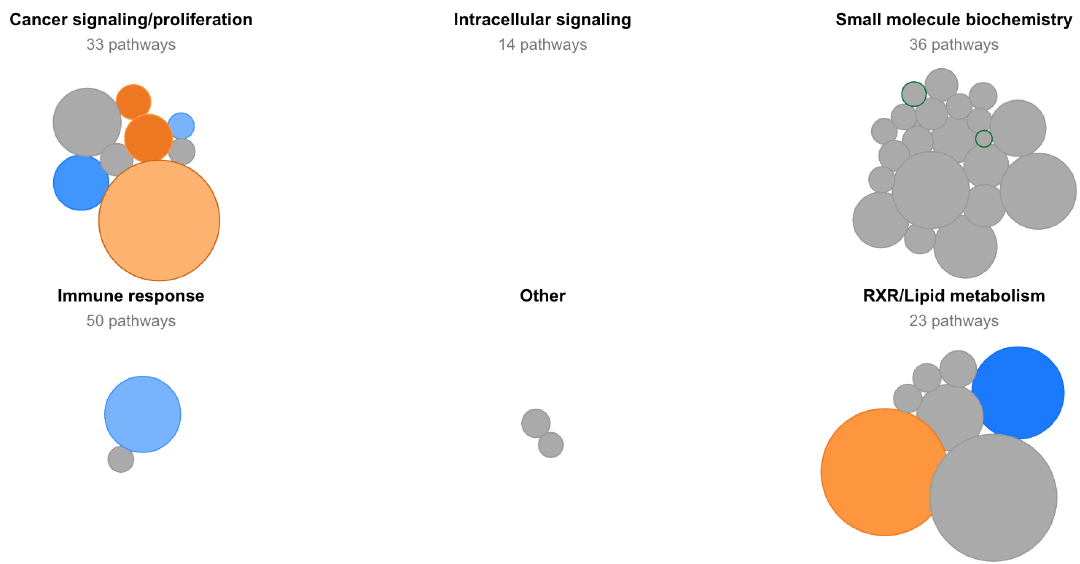
Pathway summaryThis view shows all pathways without any sorting, in order to provide a broad overview of the pathways which are dysregulated in an experimental group and how these pathways change throughout the experiment. |
 |
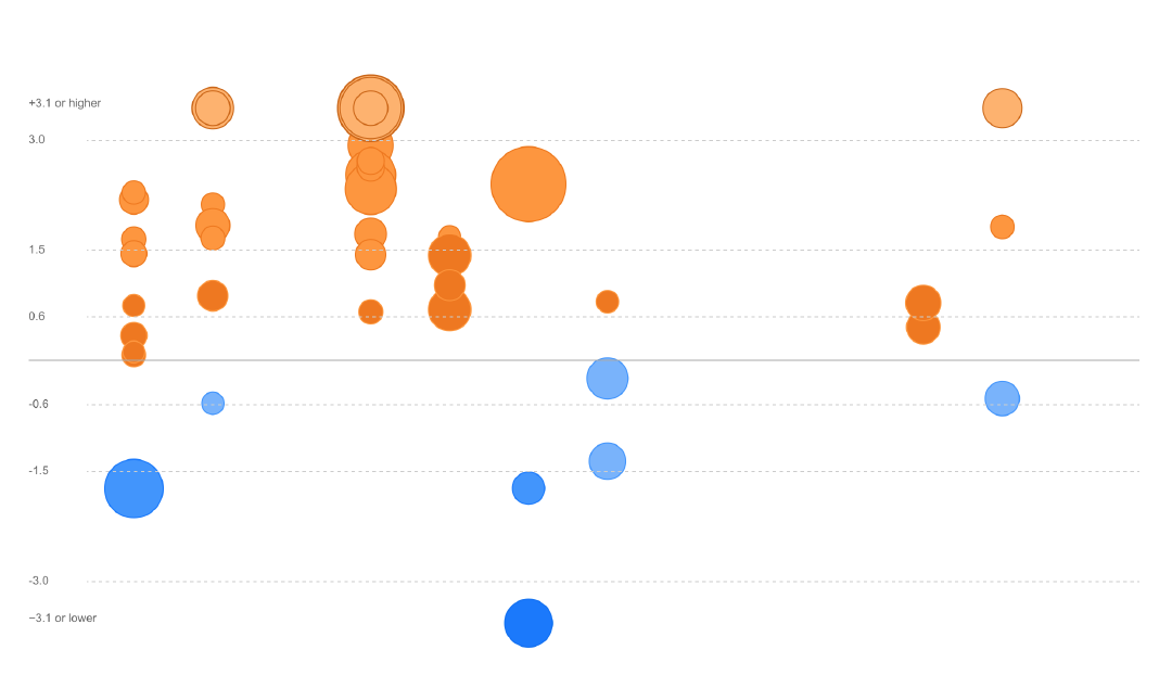
Only pathways with information about predicted activation or inhibition are included in this view. Pathways are separated horizontally by their category and vertically according to their Z-score. Higher Z-scores (predicted activation) are sorted near the top of the page and lower Z-scores (predicited inhibition) are sorted near the bottom.
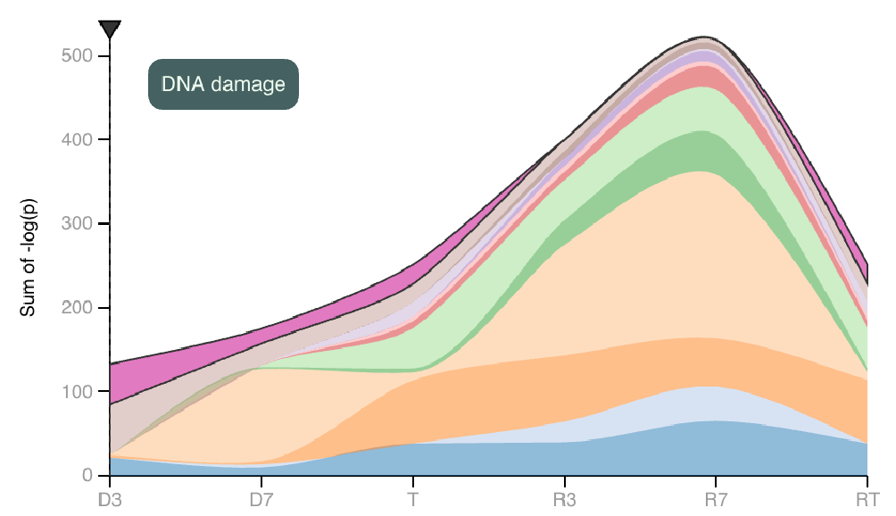 |
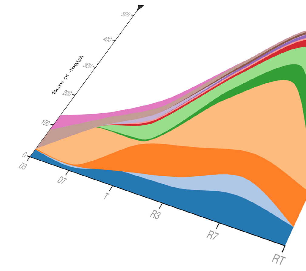
The area map on the left depicts the sum of pathway P-values for each category and how these sums change between each experimental group. Hover to focus on one category. |
| The area map on the right depicts the same data, with the P-value sums in each experimental group scaled to 100%. | 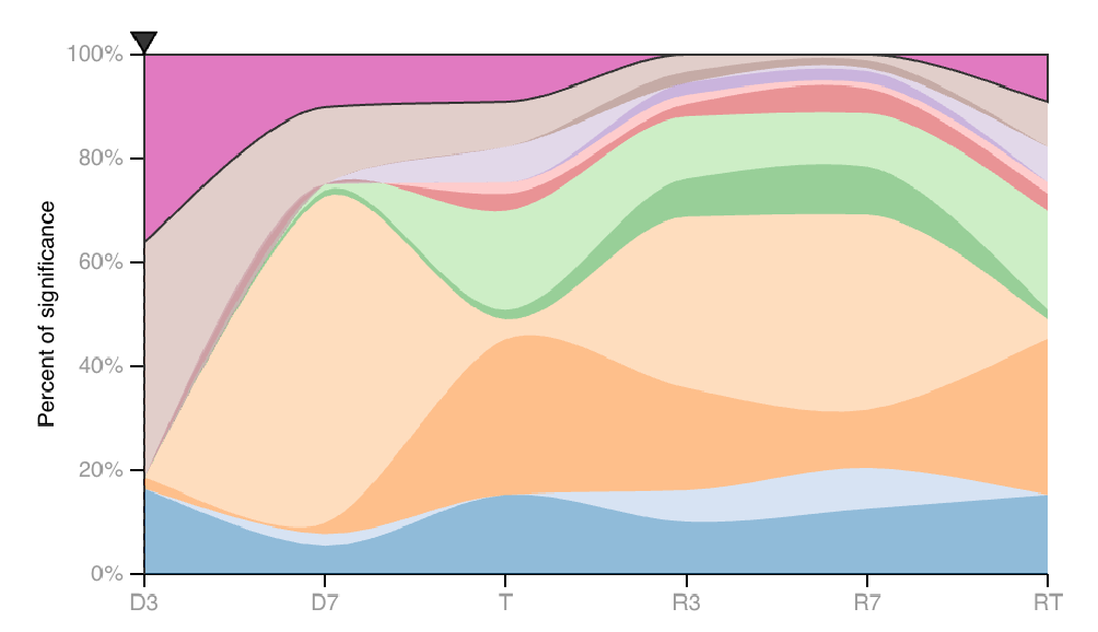 |
Below the stacked area maps, pathways are organized according to their category. Clicking on a category name will open more detailed information about its pathways and the selection criteria for inclusion into the category.
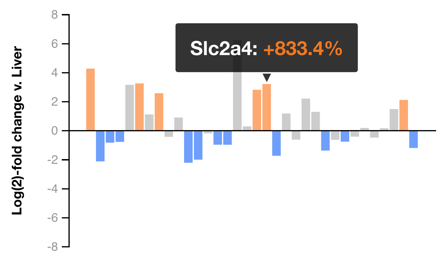
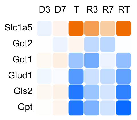
HeatmapsWhile IPA has a plethora of pathways in which genes can be grouped, the results may not contain a particular pathway or group of genes in which you are interested. In the heatmaps view, hand-selected groups of genes can be viewed as traditional heatmaps and as bar graphs displaying log-fold change in comparison to control liver. Our results include about a dozen such groups for you to browse. The ability to create and save custom heatmaps using our transcriptional data will be implemented in a future release. |
|